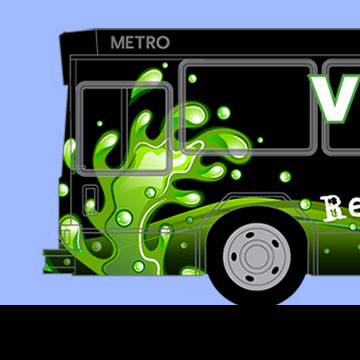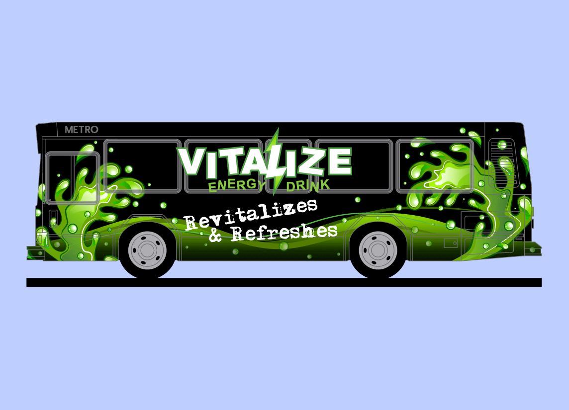
After designing the Vitalize Energy Drink logo, David was asked to design bus wrap signage featuring the Vitalize Energy Drink that would appeal to the Energy Drink's target market group which is between 15 to 29 years of age. The new brand logo and the tag line became the central focus of the bus wrap design. The tag line, set in a font called Adler Regular — a spontaneous typewriter‐style font with lots of visual artifacts surrounding each character, is stacked in two lines on intersecting angles and tilted up to the right. The background is dark which effectively punches out the logo and tag line and makes them very legible from a distance. The background graphic looks like the energy drink is sloshing around inside a bus shaped container. The overall effect of the simple pallet used in the dynamic liquid graphic has tremendous energy. When applied to a city bus this attention grabbing signage would be very difficult to ignore by any age group as it drives by.